Sunday, March 27, 2011

Israeli Japonism

A post dedicated to my beloved Japan.
These two beautiful napkins were also found in my mom's collection. Both show a western (or Israeli to be more accurate) interpretation of Japanese art and design. Or anyway, what people thought was in those days..

opened (plus some age stains)

folded

The first napkin is made out of very very delicate and soft paper which almost crumbled in my hands.
Not the usual rough type I'm used to find in the collection.
It shows a loose handed draw of probably mountain Fuji and 2 pagodas surrounded by a pink Sakura (cherry) or plum blossom. The illustration seems to have all the means to create a "Japanese" atmosphere but still there's something about the little details that feels like it's not the real thing we're seeing now. 
Stuff like the shape of the Sakura (cherry) flowers, the loose stroke and the background coloring make you feel that the artist might have never been to Japan and probably had drawn it with the aid of a photo and some and a hunch.
Anyways, this napkin is a real beauty. The 4 color print, special paper and the nicely cut edges show a good technical skill. A keeper!

opened


folded

The second and also adorable napkin shows a lovely scene with some busy geishas. Here the hand drawing is pretty loose too. Maybe to cover for some lack of reference.. Seems like the shrine or temple was assembled with some quick strokes because the illustrator had no idea how a real one looks like. No Google in those days. Anyway he added some bells at the corners just in case.


Thursday, March 10, 2011

Holiday in Tiberias


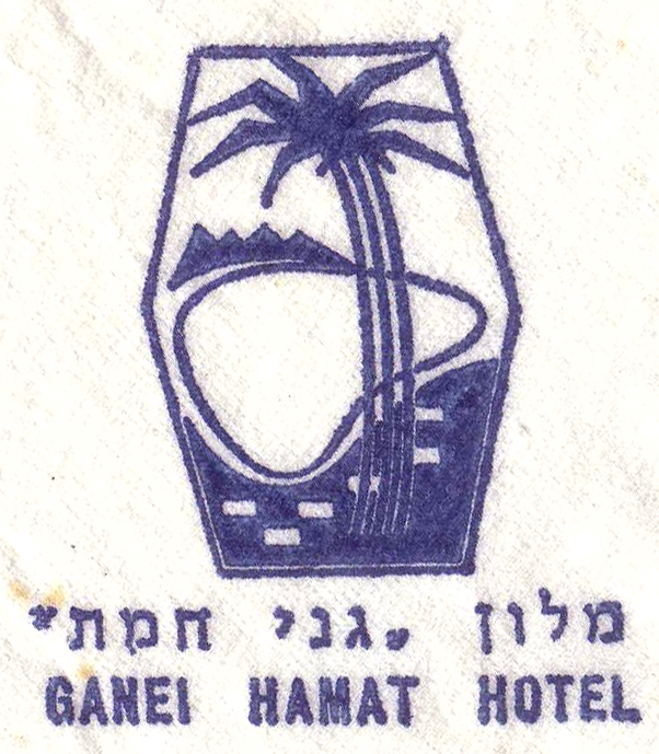
Ganei Hamat Hotel - Logo

These two napkins are from the Ganei Hamat hotel in Tiberias. Now days the hotel is known as Rimonim Mineral Tiberias Hotel (After being Holiday Inn for many years) and has been quite famous for its mineral hot springs and for the big debate in the 80's with the ultra orthodox Haredi group when ancient bones were found buried in the hotel's territory while building an annex. History aside, check out the awesome 3 colors combination at the first napkin! 
They almost managed to create the green palm tree without being completely out of line. The second is the one color contour version of the hotel's logo. Is it the hotel's logo in two design versions? 
Dunno. If you have any idea you're welcomed to comment.


Monday, March 7, 2011

All night long

Le'Haim - Cheers


I can't stop thinking of this Lionel Richie's sticky 80's song looking at those 2 lovely napkins. Great party feeling with floating bubbles and cocktail glasses. Just great!
I really like the 3 color use for the Le'Haim napkin. The color print is relatively quite accurate and the combination and patterns create a vivid and vibrant feel.
The second one makes me feel like dancing tango by a lamp post. Le'Haim!

Friday, March 4, 2011

A Hebrew lesson

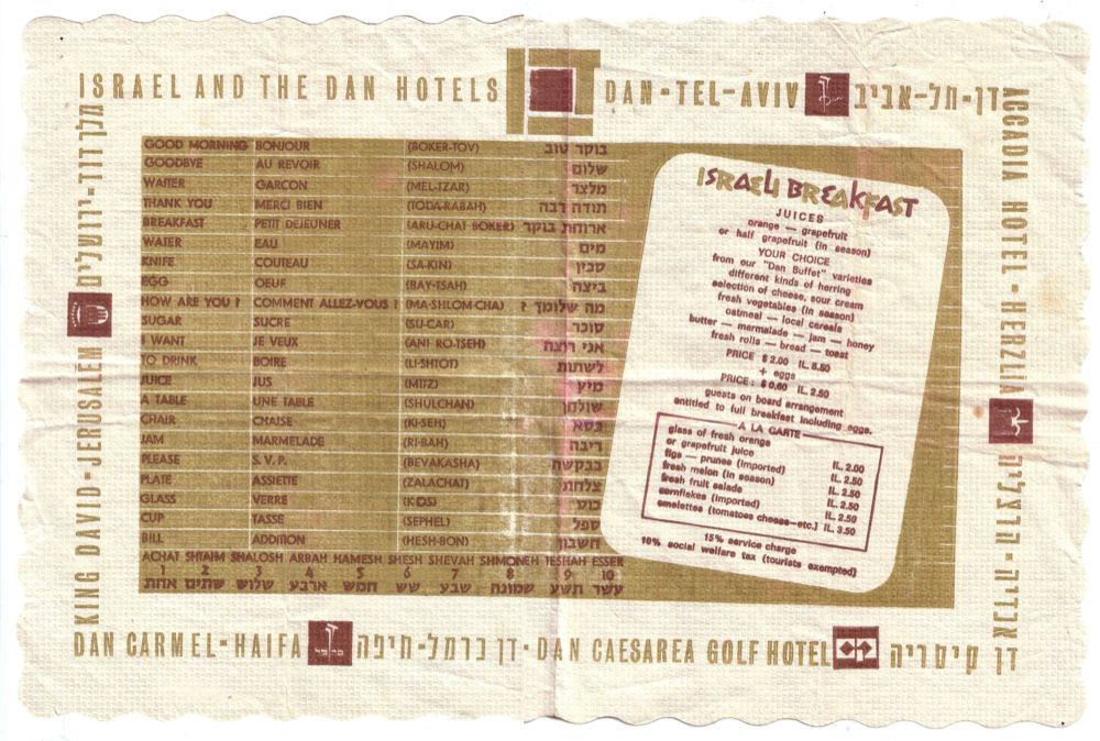
Dan Hotels - Table placemat

  
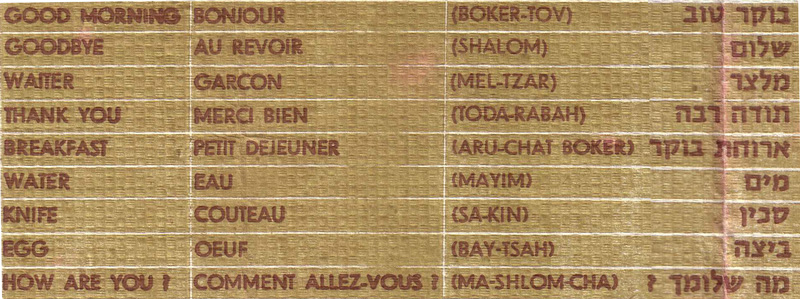
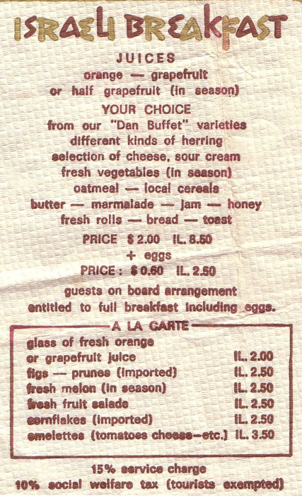
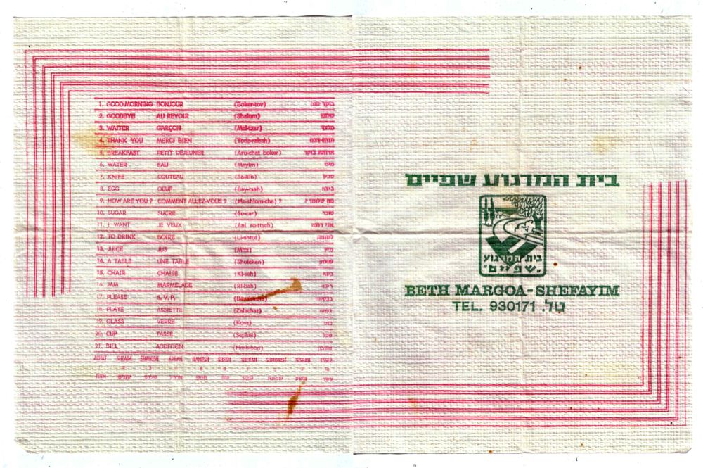
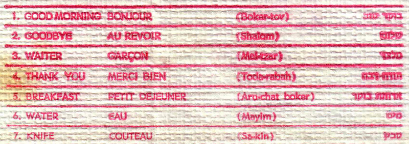
A nice way to kill your time until the scrambled egg arrives to your hotel breakfast table is to learn the native language. This is however what those two examples show.
One is from Dan hotels which still exist today and offer here a lesson and a rich breakfast. yum.

The second is from Beth Margoa in Kibbutz Shefayim. Beth Margoa (relaxing house) was the more affordable way to enjoy a relaxing vacation in the old days. Most people couldn't afford a fancy hotel and a trip abroad was a real luxury, so a weekend out of town in a green and quiet Kibbutz by the pool was a preferred option.  


Beth Margoa Shefayim - Table placemat


Beth Hamargoa Shefayim - logo

Thursday, March 3, 2011

Take me to the Milk-bar

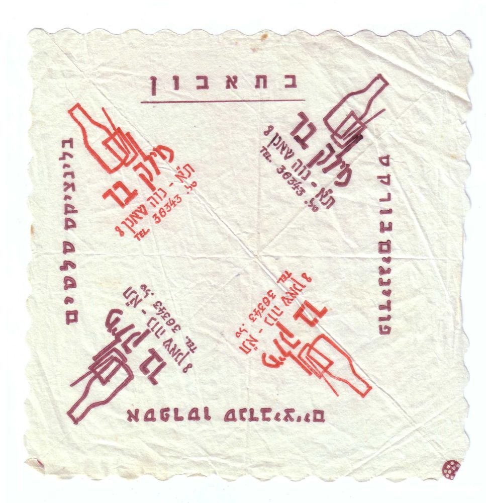
Clockwise from top: Bon appetit, pudding bourekas, espresso sandwiches, blinchiki salads.

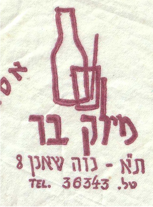
Milk bar - Tel aviv - Newe Shaanan 8
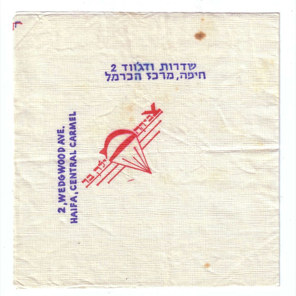
Zvika Milk-bar

One of the most popular hangout places in Israel of the 60's and 70's was the Milk-bar. A place you can enjoy a light meal and a milk-shake with your girlfriend at the times you couldn't go to the "real" bars.
Not so sure those places who offered pudding and bourekas had too much of the sex-appeal, but in those days that was the best in hand.
Both of these napkins are from 2 different Milk-bars. One was in Tel-Aviv and the other was in Haifa.
Both seem to be drawn by hand, including some typography which
has its charm now days.

The Zvika Milk-bar logo is without a doubt hand drawn (in a very naive way..) and influenced by the Israeli army paratroops symbol. After a short research I found out this place was named after Zvika Kestler. The paratroop son of the owner who lost his life in 1968 in the battles of the war of attrition (Ha'hatsha).
Now days this place functions as the old timer pub The Bear Inn (Pundak Ha'dov).


Wednesday, March 2, 2011

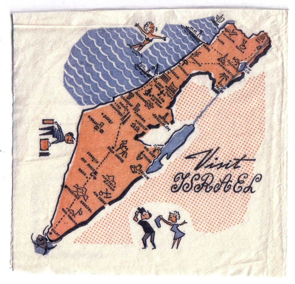
Visit Israel

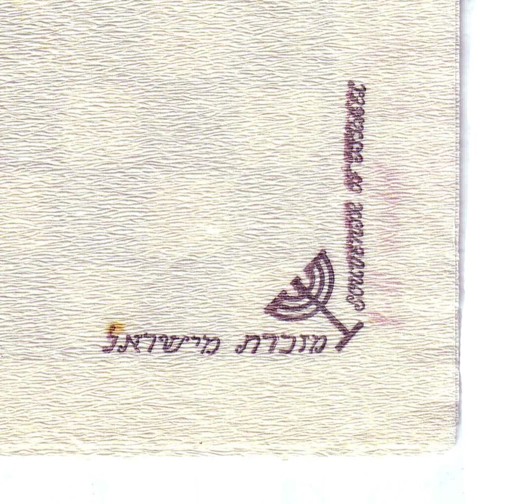
Label on the back: Souvenir of Israel
This one is quite pretty. A pre 67' map view of Israel with all the touristic hot-spots.
Pretty much influenced by the American illustration style of those days and still has something more laid-back about it. I really like the textures created with the 3 color palette!

On the back you can find a label I found on many napkins in the collection.
Must have been published by the ministry of tourism. More from this series to come!

Tuesday, March 1, 2011

Every woman's dream

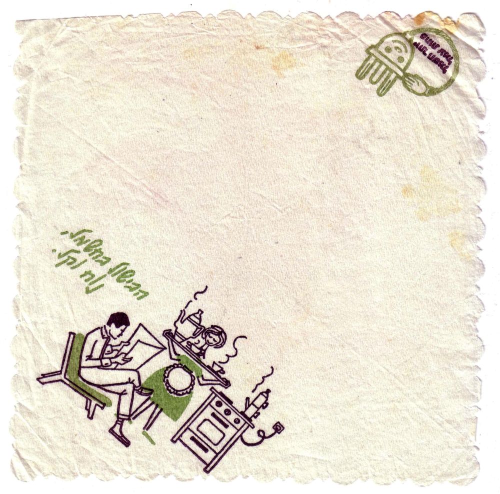
From Hebrew: Cooking with electricity, nice and easy


From Hebrew: More electricity, less work

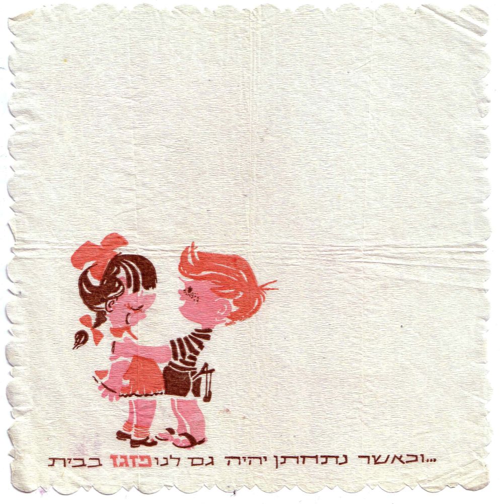
From Hebrew:...And when we marry we'll also have Pazgaz at home


I have no idea what the national electricity company and a gas company need a promotional napkin for, but in the old days that was a good way to reach the people.
What is more typical for those days is the illustration of the happy and bashful housewife serving her faceless husband a hot drink while he's reading the newspaper after a long day at the rat-race.
Thanks to electricity, she can serve the hot tea faster than before and keep smiling. Thank you electricity!

On the second napkin for the Israeli gas company Pazgaz, you can see how to make a girl sky-rocket with joy. Marriage AND gas!

Yep those napkins seem funny today though sometimes I feel those messages aren't completely gone. Just became more sophisticated.

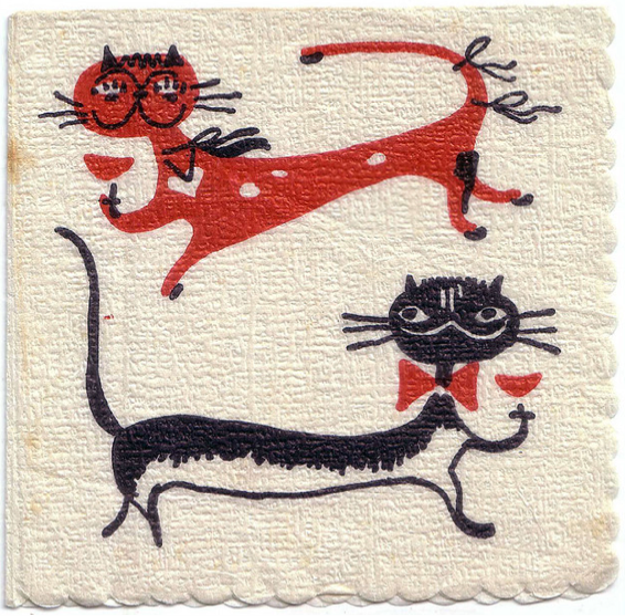
Drunk cats


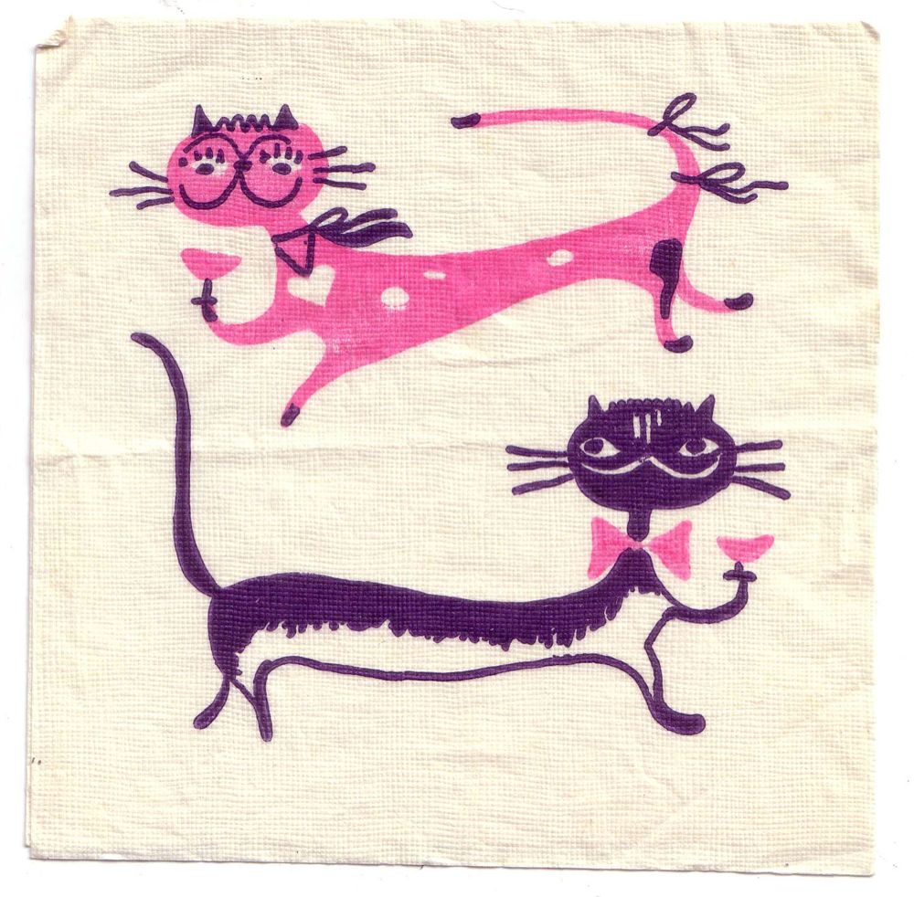
 pink and purple

As a cat lover I would definitely be a regular in a bar that serves this kind of napkin with my Bloody mary. I really like the 2 color use to create all the little details so we understand there's a boy-girl situation here. I also found another colors combination for this design. Both are great!